Home / Japanese lessons / Hiragana
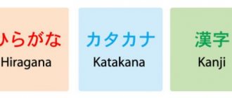
Hiragana (平仮名) is the Japanese syllabary, one of the components of Japanese writing along with katakana, hieroglyphs, Arabic numerals and Romaji (Roman alphabet). Hiragana and katakana together make up the kana system, in which one character expresses one mora. The kana sign can convey a vowel sound (for example, "a" あ); a combination of a consonant followed by a vowel (for example, “ta” た), or a nasal sonant “n” ん, which, depending on the context, can sound like Russian n, m, English ng or French nasal vowels. Hiragana is used for words that do not have kanji, including particles such as made まで and suffixes such as san さん.
Here you can:
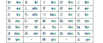
- the entire Gojuon table of the Hiragana syllabary.
- View the order in which each syllable is written in the Hiragana alphabet.
- Download the copybook for each syllable of the Hiragana alphabet.
- Listen to the correct pronunciation.
- Read children's stories in hiragana
- Take the Hiragana knowledge test.
- New memory development game “Find the Pair” for Hiragana.
Where to begin?
If you are already familiar with all the hiragana characters, we recommend that you start by reviewing the basics. You have to find out the hiragana sign and choose the correct one from the list of answers. Proceed to the next section only if you are sure that you have a good memory of the Japanese writing characters. The tasks may seem difficult at first. Don't be afraid of mistakes! Practice regularly for 10-15 minutes a day, and within 2 weeks you will be able to achieve good results. Remember, hiragana is the basis of Japanese writing. The stronger your basic knowledge, the easier it will be for you at the first stage of studying at a language school.
| Basics of Hiragana Dakuten and Handakuten Almost all hiragana Yeon All hiragana Go to katakana |
Many thanks to Dmitry Budaragin (twitter) for the test. And also to Anton Gnatyuk for improving the test and creating new ones.
Fast and slow reading
Reading for study can be divided into two different types. One is intensive reading to fully understand a relatively short and complex text, carefully checking unknown vocabulary in the dictionary. This type of reading is most often found in the classroom, where questions to check understanding are frequently asked. Translating the text also requires careful reading.
The other type, fluency reading, requires a broad understanding of a relatively longer but simple text that is read without stopping for analysis, it is associated with reading for pleasure. It has the advantage of increasing the amount of data received, allowing the reader to naturally assimilate vocabulary in context. Intensive reading, on the other hand, makes it possible to master words and phrases that require more effort to learn. Combining these two approaches to training will allow you to get the best results.
Some studies show that reading and learning fluently requires 98% text comprehension. Before diving into a book that looks interesting to you, you can assess your level of understanding of the text by counting the number of unfamiliar words on the first page and roughly determining their percentage of the total. This is, of course, very general advice, but if you don't know 10% or more of the words in the text, the book may be too difficult for skimming and more suitable for intensive reading.
Hiragana and script characters
Features of the table
- Spell the sign by clicking on the picture,
- Copybooks in PDF format.
| A | And | at | uh | O |
| ka | ki | ku | ke | co |
| sa | si | su | se | with |
| that | you | tsu | te | That |
| on | neither | Well | ne | But |
| Ha | hee | ugh | heh | xo |
| ma | mi | mu | meh | mo |
| I | Yu | e | ||
| ra | ri | RU | re | ro |
| va | n | o (pad.) |
(RTF, 219K) Go to katakana
Stay motivated
During intermediate language learning, many people experience a plateau as the feeling of rapid progress at the beginner level is replaced by a feeling of slowing progress in learning. This is where it makes sense to look beyond textbooks and find something more challenging to read, and for busy adult learners, it can be a challenge through trial and error to find a consistent source of reading material that is both interesting and appropriate for their level of knowledge (this I speak from personal experience).
So, in closing, I will reiterate the importance of motivation. Reading in general introduces you to many different grammatical structures that are difficult to remember out of context. I liked Higashino mysteries and later found that they helped me understand a wide variety of texts in my professional life, from corporate reports to political articles, and I think it's better to read mostly what you like and what motivates you than worry about what you “need” to read.
Table of syllables for borrowed words
The following is a table with a combination of syllables that are used to record sounds in borrowed words - gairaigo
.
| シェshe She | ジェje Jae | チェche Che | ヂェdje Jae | |
| イェe E | スィsi Si | ズィzi Dzi (Zi) | リェre Re | |
| ティti Ti | トゥtu Tu | テャtya Tya | テュtyu Chu | テョtyo Cho |
| ヂィdi Di | ドゥdu Du | デャdya Dia | デュdyu Du | デョdyo Dyo |
| ツァtsa Tsa | ツィtsi Qi | ツェtse Tse | ツォtso Tso | |
| ファfa Fa | フィfi Fi | ホゥhu Hu | フェfe Fe | フォfo Fo |
| フャfya Fya | フュfyu Fu | フョfyo Fyo |
Example:
“Maria” will come to the party tonight?
Katakana
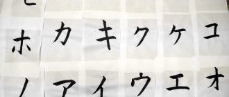
Katakana is commonly used to write words that came to Japan from other countries. For example, the word “tennis” in Japanese does not have a hieroglyph and is written in katakana - テニス (tenisu). Here
.
Here are some more examples:
- レストラン (resutoran)
- アメリカ (amerika)
- ロシア (roshia)
- スパゲッティ (supagetti)
- カメラ (kamera)
- コンピューター (konpyuutaa)
Probably even by reading their pronunciation you already roughly understand what these words are. In its structure, katakana is most similar to hiragana. It also consists of 71 letters and is read the same way. It also has dakuten, handakuten and small tsu, ya, yu, yo. But there are also two things in katakana that are not in hiragana.
Sounds not found in Japanese
The Japanese language is very limited in the number of sounds. It’s hard for Russian speakers to imagine, but the Japanese do not use very popular sounds from the Russian language and, accordingly, pronounce them poorly. The most famous example is that the Japanese very often cannot pronounce “R” and “L” and usually pronounce some incomprehensible combination of these two sounds. Similar things happen with other sounds, but the Japanese get around by combining several different sounds that are easier for them to pronounce. The missing "v" sound is replaced with something similar to a "b". For example, ヴァ is made up of the sounds "vu" and "ya" (small) to make the sound "va", but since the Japanese have trouble pronouncing this sound, it is often heard as something between "ua" and "ba" " The absence of the "fa" sound is replaced by a combination of フ (fu) and ァ (small ya) to form "fa".
Vowel lengthening
In katakana there is a special character for lengthening a vowel - "ー". Just like the little tsu, this sound does not have its own pronunciation, but it does have its own function. The vowel that comes before this symbol becomes longer. タ (ta) when adding a stroke turns into ター (taa), マ (ma) into マー (maa) and so on.
Useful resources
We can recommend a set of suggested resources - it is not exhaustive and is focused mainly on news and books (mainly fiction).
Simple Japanese (Yasashii Nihongo) online:
NHK News Web Easy
Matcha (mostly travel articles)
Withnews (Yasashii Nihongo series) and their Twitter account @yasashiinews
Hukumusume (a site with Japanese fairy tales, legends and other stories for every day of the year)
News sites:
Nippon.com has a page in Japanese. Most of our articles appear first in Japanese and are then translated into English and other languages. At the top of the article, you can click the 日本語 link in the language list to view this article in Japanese.
Yahoo News and NHK News (you can find popular articles in the [ランキング] ranking).
Newspapers:
Printed editions of daily newspapers such as the Yomiuri Shimbun and Asahi Shimbun are especially good for people who like to write in the text while studying. The newspapers are not simplified, but they adhere to standard Japanese, which makes them easier to read.
Children's books:
If you're in Japan, I'd recommend browsing the children's section of a bookstore (although amid the coronavirus, precautions should be taken when visiting stores to avoid the risk of infection). If you find an author or publisher you like, it will be easier for you to choose your next book. I would recommend the Popura Poketto Bunko (ポプラポケット文庫) editions because of their range of fiction and non-fiction and their clear indication of the level of reading skills required on the cover.
Additional training materials:
Different books can be a good option to improve your vocabulary on different topics. For example, in the "Society" (社会, shakai) section of the store you will find books on geography and history, or you can brush up on your knowledge in the "Science" (理科; rika) section. You might want to try くらべてわかるできる子図鑑 (Kurabete wakaru dekiru ko zukan) for students preparing for the high school entrance exams - browse the different sections to find what you like. By the way, the official study guides 漢検漢字学習ステップ (Kanken Kanji Gakushu Sutheppu) for the Japanese Kanji Proficiency Test can be surprisingly good for practicing intensive reading of short sentences.
How to write hiragana
Let's take a closer look at the rules for writing this particular alphabet, because it is key and fundamental for learning.
Hiragana is associated with smooth lines and rounded shapes. Therefore, when studying the letter, pay attention to the fact that there are practically no straight lines in it, they are all slightly inclined or curved.
Japanese language and its alphabet: Series “A”
あ
- written in 3 lines. Note that the second one is slightly curved to the left. You should start writing the bottom part of the sign from the right. It looks like a small pretzel. This element is often found in hiragana.
Some letters are similar to each other, so it is so important to write them correctly so as not to get confused. For example, if written incorrectly, “A” can be confused with “ME”.
い
- 2 traits. The first is of the “jump” type, which results in a small hook at the end of the line. It looks a little like a putter. The second line is shorter than the first. If you make it longer, you get “RI”. Both lines are slightly curved.
お
- consists of 3 features. The first is written on the left side of the square. The second stroke is a vertical line that turns into a rounded curl that resembles the bottom of the letter “A.” The last line is a short stroke at the top right.
え
- this letter has only 2 strokes. The first is simple and straight at the top, and the second is a line similar to the number 1 with a wavy line at the end. You need to make sure that this wave is not too long and does not go too high.
う
- 2 traits. Small line at the top (same as in “E”). And below there is a curved line, similar to an ear. And do not confuse this letter with “RA”.
Japanese letters, Hiragana alphabet: Series "KA"
か
- 3 traits. Notice that the first line is a “corner”: a curved line that goes from left to right, going down. The second line is vertical. It is placed on the left side of the square and written with a slight slant. The last line is a small line in the upper right part.
き
- 4 traits.
First, two parallel lines are placed. Then - an inclined straight line. The final touch is slightly curved and is placed at the bottom. Unlike the printed version, in the letter the third and fourth lines do not intersect
.
く
- 1 feature resembling an angle. The main thing is to ensure that the upper and lower halves are the same length.
け
- 3 traits. The first curved line is on the left side of the square. On the right side, a small horizontal line is written, which is crossed by a long line, rounded at the bottom. This part looks a bit like a cross.
こ
- 2 traits. They are placed one above the other and both are slightly curved. Moreover, the first line is shorter than the second.
Nigori signs are placed on the right. These should be two lines of equal length. Don't place them too close to the main syllable.
Japanese alphabet and its symbols: Series "SA"
さ
- 3 traits. In Japanese there are letters that are similar to each other. This sign, for example, resembles “KI”, only instead of two horizontal lines there is one. In the letter, the second and third lines are also not connected.
し
— 1 vertical line, smoothly rounded at the end.
す
- 2 traits. The horizontal line is crossed by one vertical line, which twists into a knot in the middle and ends its path with a slight bend to the left.
せ
- 3 traits. The first one is horizontal, it is slightly directed upwards. The next line is vertical and short. A small tail forms at its end, as it is of the “jump” type. The latter is also vertical, but at the bottom it smoothly bends to the right.
そ
- 1 trait. This letter is written with one touch. Its upper part resembles the English “Z”, and at the bottom a line curved to the left is added to it.
Japanese alphabet: Row "TA"
た
- 4 traits. On the left side of the square, the lines form a cross: a short horizontal line is intersected by a long vertical line. On the right, under the first line, two parallel lines are placed, similar to the small letter こ (KO).
ち
- 2 traits. The first is short and horizontal. The second vertical line begins with a slight slope to the left and ends with a semi-oval bend to the right. Reminds me a bit of the number 5.
つ
- 1 line curved to the right. Its upper part is longer than the lower.
て
- 1 trait. From the end of the long horizontal line, going slightly upward, a line curved to the left extends. It is important to remember that this letter is written with one touch.
と
- 2 traits. A short inclined one touches a small semi-oval.
Japanese alphabet, how to write: Row "ON"
The multiple curlicues make this row the most difficult to memorize in all of the hiragana.
な
- 4 traits.
On the left is written the same “cross” as in the letter た (TA), only shorter. Please note that the third line is a small slant, and the one written below it is the fourth, and not vice versa. This last line at the end is twisted into a “ knot ”.
Remember this element, it is key in this series.に
- 3 traits. A large vertical line is placed on the left side, and two parallel lines similar to こ (KO) are placed on the right side. Make sure there is enough space between them.
ぬ
- 2 traits. The first vertical stroke is written at an angle. The second line is similar to the bottom of the letter あ (A), only with the difference that at the end it twists into a “knot”.
ね
- 2 traits. The first line is a vertical straight line. The next stroke is one whole, it is written in one touch. It starts in the upper left corner. We write a small zigzag, which at the end turns into a rounded fool and again twists into a “knot”.
の
- 1 trait. A curved line goes from the middle to the lower left corner, smoothly rising to the top and forming a semicircle on the right side of the square.
Japanese hiragana syllabary: "HA" series
は
- 3 traits. The first long line is the same as in に (NI). The second is horizontal, it is crossed by a vertical one, twisting into a “loop” at the end. This last stroke is similar to the 4th line in the letter な (NA).
へ
- 1 trait. It starts on the left side in the middle of the cell, goes up and in the middle goes to the lower right corner. The second part is longer than the first, so be careful.
ふ
- 4 traits. A small vertical stroke is placed at the top in the middle. Then a small arc curved to the right is written, and two lines similar to commas are placed on the sides. They look in different directions.
ひ
- 1 trait. In the upper left corner, a short line is drawn upward, which goes down, forming a semicircle, which ends with the same line in the upper right corner. Keep in mind that this semicircle is slightly tilted to the left.
ほ
- 4 traits. This letter is very similar to は (HA), but on the right side at the top there are two strokes rather than one. Be careful when writing the fourth line, because one does not go beyond the second.
As you remember, from this row the rows “BA” are formed, which is written with the nigori sign, and the row “PA”, which bears the hannigori symbol. He, just like his brother, is placed in the upper right corner:
Japanese letters: "MA" series
ま
- 3 traits. First, two identical horizontal lines are placed, which are crossed by a vertical one, curling into a “loop” at the end. This letter is similar to the right element in ほ (ХО), but in this case the last vertical stroke extends beyond the first line.
む
- 3 traits. The first stroke is an ordinary small stroke. The second line at the beginning is very similar to す (SU), but it does not end at the bottom, but goes to the right and up. A small “comma” is written in the upper right corner.
も
- 3 traits. This letter is similar to し (SI), which is crossed by two parallel lines. Care must be taken in the order in which the strokes are written. Unlike き (KI) and ま (MA), the horizontal strokes of this letter are placed after the “hook” is written.
み
- 2 traits. The first line starts in the upper left corner, goes up a little and then goes down, twisting a small “loop”. At the end of the first line there is a small vertical line parallel to the left side.
め
- 2 traits. This letter is very similar to ぬ (NU), but it does not have a “knot” at the end.
Hiragana for children: Row "I"
や
- 3 traits. "I" begins with a small arc in the upper half of the square. A comma-shaped stroke is placed above it in the middle. Then a vertical line is drawn from the upper left corner to the middle.
ゆ
- 2 traits. The first line starts in the left half. A small vertical stroke turns into a semicircle. In the second half of the square it is crossed by a vertical curved line.
よ
- 2 traits. First, a very short line is placed on the right side of the square. Next, the already familiar vertical line with a “loop” at the end is drawn exactly in the middle. Same as in ま, は and ほ.
Hiragana to learn: Row "RA"
ら
- 2 traits. In the middle of the square, a small oblique line is placed on top. Then - a vertical line turning into a semi-oval.
り
- 2 traits. A vertical, slightly curved line is drawn on the left. The second line is longer than the first, it bends slightly to the left at the end. In the printed version, these two features intersect.
る
- 1 trait. It starts with a zigzag, which turns into a semicircle, ending with a “knot” at the end. However, please note that, unlike other similar “loops” (in な, ま, ほ), this one does not have a tail.
れ
- 2 traits. This letter is similar to ね (NE), but here the end of the second line does not form a “loop”, but bends to the right.
ろ
- 1 trait. Everything is quite simple here, because this letter is written in the same way as る (RU), but without the “knot” at the end. The main thing is not to confuse them now! Please note that the line ends in the middle of the cell.
Complete Japanese alphabet: Series "BA"
わ
- 2 traits. Does this letter remind you of anything? It is written in the same way as ね (NE) and れ (RE), but here the end of the second line forms a semi-oval.
を
- 3 traits. The first is horizontal. The next one is vertical. It comes from the middle and is inclined to the left, then an arc is drawn from it to the right. This element is similar to the English letter "h". The last line is a semi-oval curved to the left, similar to an inverted つ (TSU).
ん
- 1 trait. A small “wave” extends from a vertical line slanted to the left. This symbol is also similar to the letter "h" written in italics.
